Motivation
I’ve been wanting to make a personal website for a while. I knew about the indie web for quite some time, but as someone with basically no HTML and CSS experience, the process seemed a bit intimidating to me.
Then, after many more cases of social media becoming more and more of a hellscape, I decided to finally go in and learn how to create a website.
Now where to start?
In one hand, my brother is a full-stack dev, so he could probably give me some pointers, on the other hand… I’m not showing him my hyperfixation website. Cringe culture is dead, but you have to be a very specific type of person for me to willingly show you anything ship art related.
So I made my way into YouTube and watched some HTML, CSS, and JavaScript crash courses.
Before I even started coding anything, I was also really curious about how to make a gallery. Creating fan art is one of the main ways I interact with things I like, so it was really important to me having a gallery section in my website. That led me to find some really handy resource lists and guides!
-
These three in particular helped me a lot:
- des' notebook
- 32-Bit Cafe resource list
- Solaria's guides
* I won’t get into the making of my gallery in this blog post, but for anyone curious, I went with GLightbox as my lightbox.
Ok, let's try this
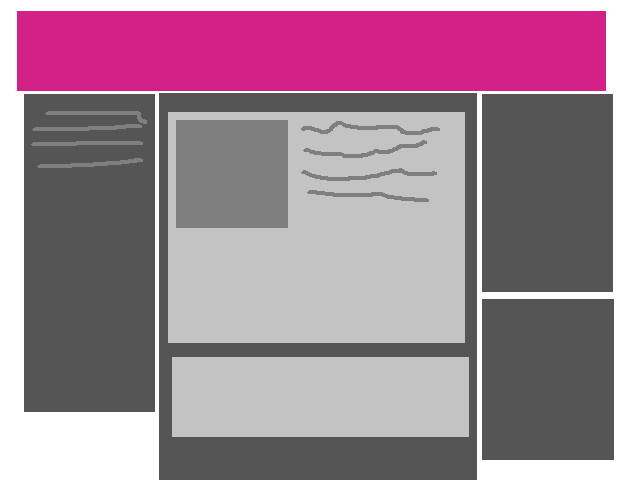
So after a few days of researching, I finally begin actually working on the website. I barely had any plans on how it would look like besides this dumb paint doodle.
I wasn’t feeling like spending too long refining a design somewhere else because I wanted to jump straight into coding it.
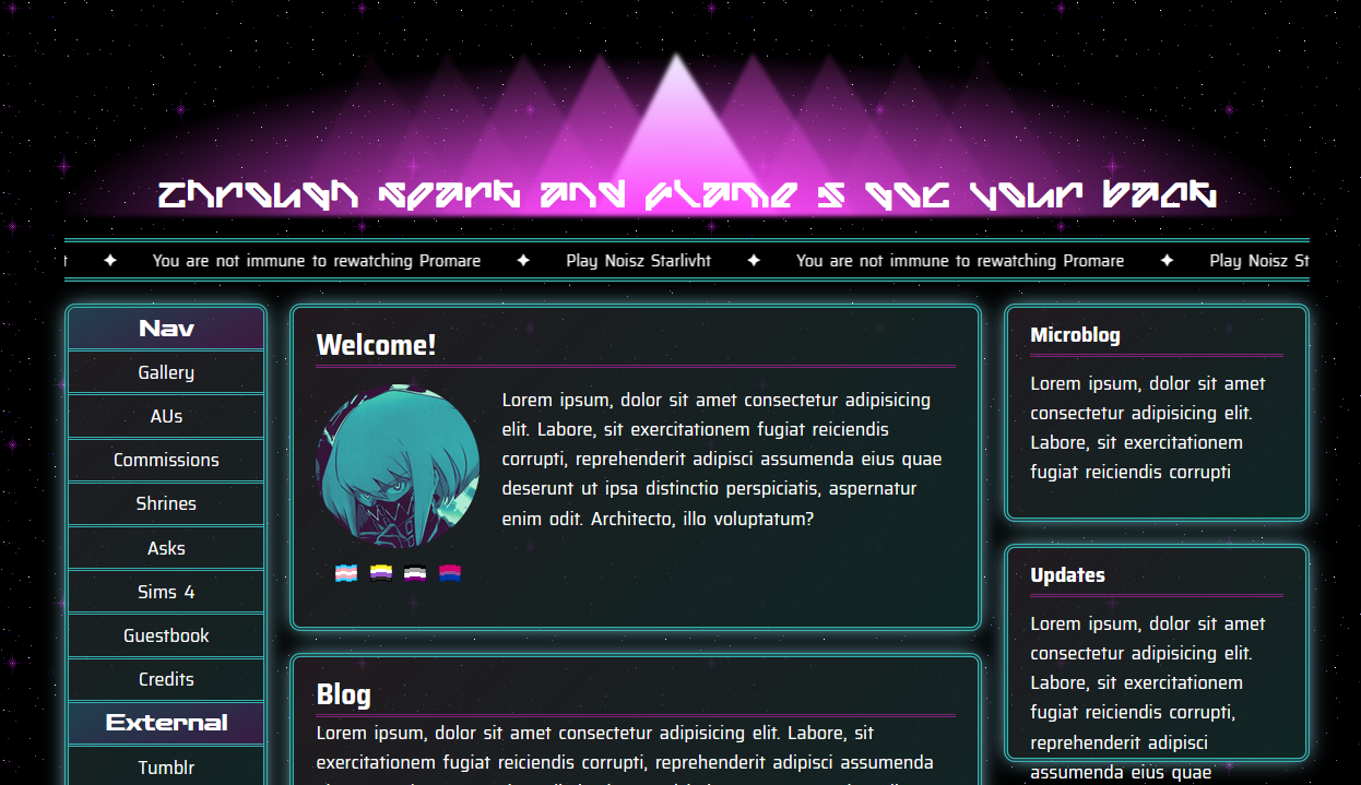
You might see that there’s way more navbar links in this screenshot than I currently have in my website. I plan to slowly add them back as I work on their respective pages.
Working with HTML and CSS was actually more chill than I expected. My code is most definitely not the cleanest thing, but as someone who avoiding even learning it in the first place, I was really surprised.
JavaScript jumpscare
My first roadblock was when I wanted to make the scrolling text under the header. The HTML and CSS only alternative had you making multiple copies of your text directly on your HTML file in order to have enough text to loop your animation, but I really wanted to be able to just add it once to the list and have it automatically copied as much as needed, so there I go using JavaScript.
My problem was that the tutorials I found only showed how to have your script duplicating your content once, since their examples had way more than two short lines of text. So I had to tinker with the script until I found how to duplicate it proportionally to how many messages were added. That is probably something really simple to figure out if you understand JavaScript, but I don’t, so I will take that as a win.
Trying to make things pretty
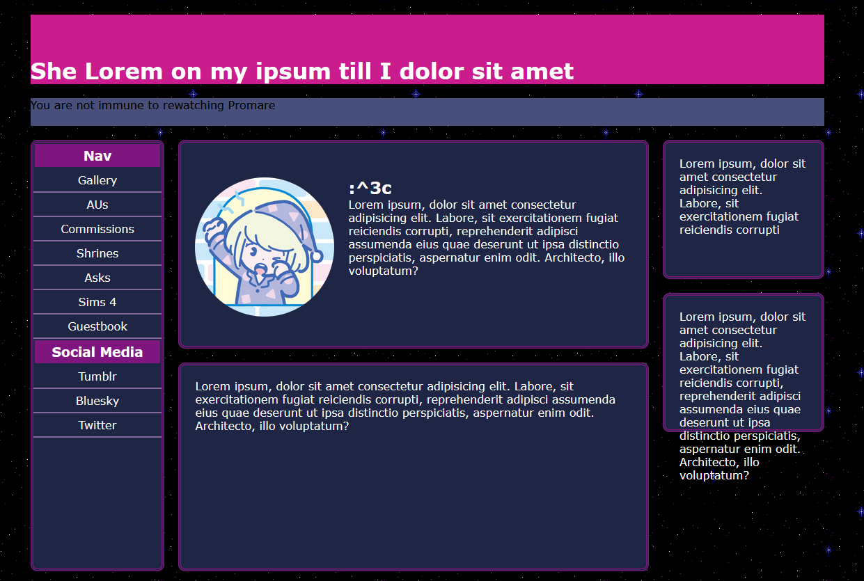
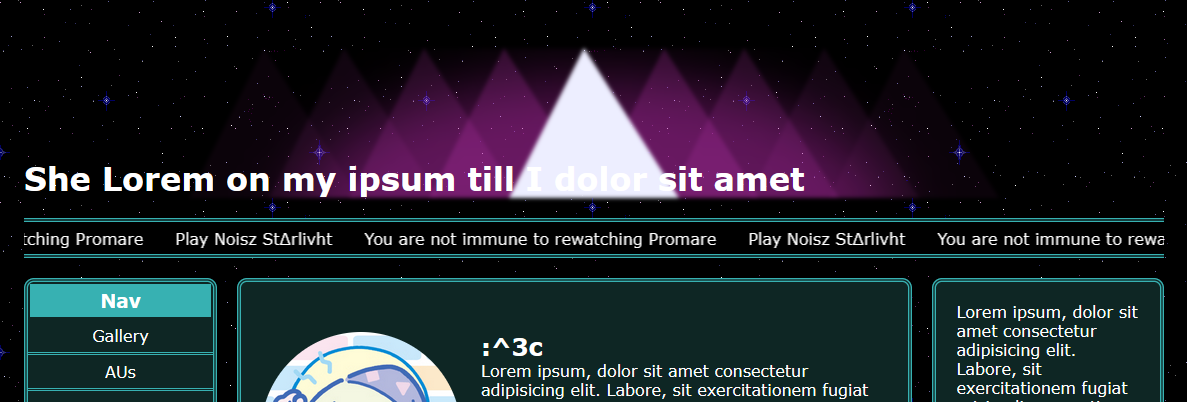
So far I wasn’t quite satisfied with the color scheme of my website. I knew I wanted the overall look to be based on Promare, so I decided to pick colors from the opening sequence in particular. That’s how I decided on the current combination of magenta and green and also where I got the idea for my header design.
I really wanted to make it with CSS rather than using an image, so it took a lot of tinkering to get to a result I liked.
Early version of the header.
The text was something I wasn’t sure if I was going to leave in the final version, but after messing around with some fonts I have, I started to dig the idea of using a really alien looking font, as if you were hearing the promare.
With that, I changed the placeholder header text to “Through spark and flame I got your back”, a quote from Promare. It’s not really supposed to be readable, but it’s there as an easter egg if someone decides to inspect the page or copy and paste the text.
After some more tweaks, things started getting somewhere, but I was still neglecting the actual content in the page.
Bye bye placeholder text!
I'm using Zonelets for my blogging section. Zonelets itself is pretty easy to use out of the box, but I wanted to change the default folder paths and some other HTML generated by the script, so I had to figure out how to do that without breaking stuff.
After dealing with that, all I had to do was add the “recentpostlistdiv” ID to a div inside my blog section and style it.
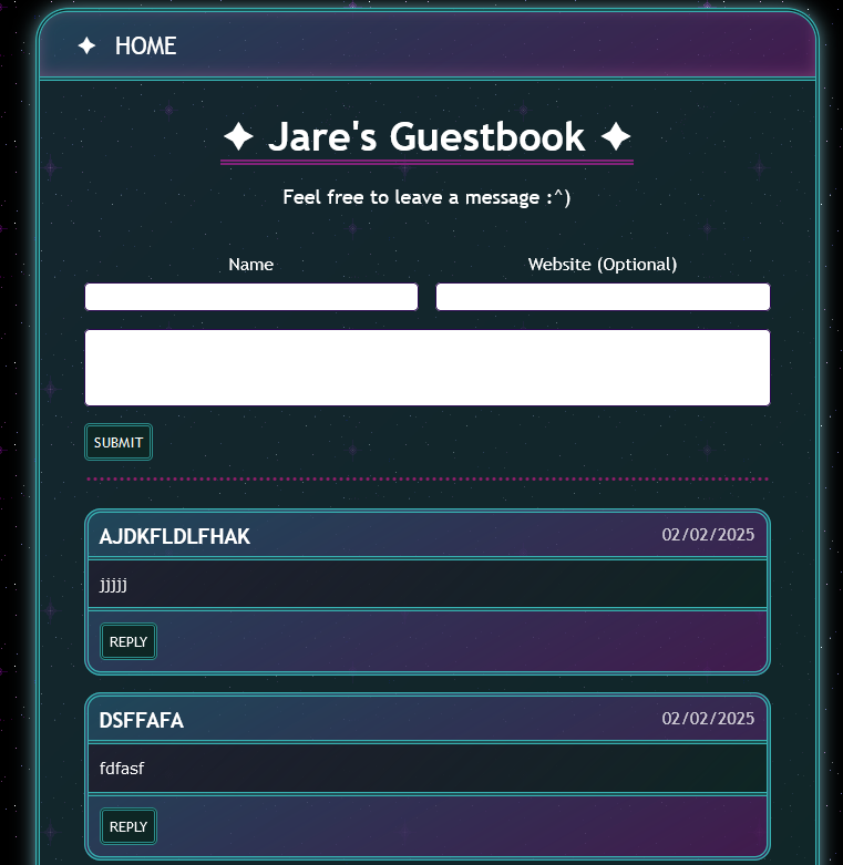
Amazing test messages for CSS styling purposes.
For both my blog comment section and my guestbook, I used ayano’s Comment widget. Also pretty easy to use, but I kept messing up forgetting to change the Timestamp column name since it gets generated based on your default language, whoops.
For my update section I wanted to add an RSS feed, in case anyone wanted that, and also so I wouldn’t have to manually edit the HTML every time. Bechno Kid's StatusCafe feed reader worked really well for that!
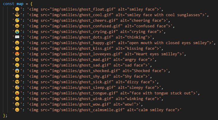
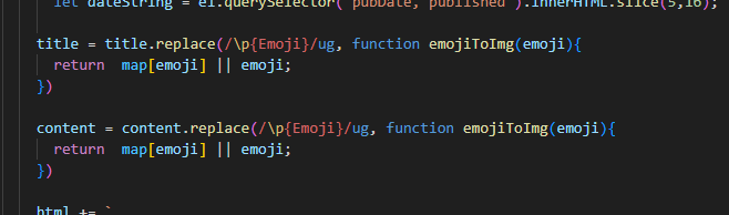
I also really wanted to use personalized emoticons while keeping only Unicode emojis in the XML file itself, so I did some digging and included some code that converts it in my feed reader.
At the time, I still didn’t have a StatusCafe account, so I was updating my microblog with a Google spreadsheet using a modified version of ayano’s Comment widget.
Wrapping up
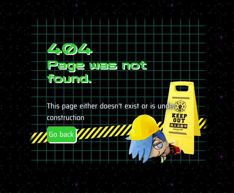
I really like how my error 404 page looks like, by the way.
There were some other small struggles I don’t really remember exactly at which point occurred, like when I started testing on Chrome and saw that it handled grids differently so it was messing the layout on smaller widths, or deciding what to say in the about section, but after I finished adding the microblog I pretty much just made the credits page, styled the not_found page and made my site live for the first time :^)
That about wraps up my initial experience making this website. I might make another blog post about how I made my gallery page in the future, as this one is long enough already.
I hope that was interesting or at least useful in some way 